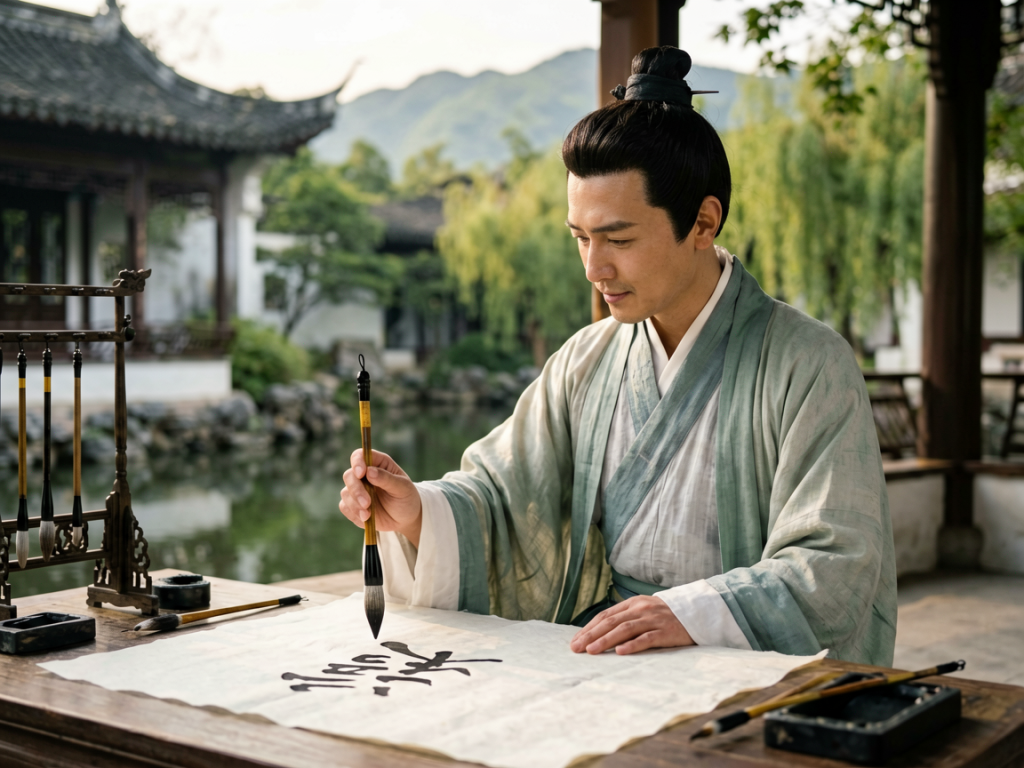
I used to think calligraphy was all about soul. You know the vibe. You dip a bamboo brush into black ink, you close your eyes, and you let some ancient spiritual energy flow through your arm. I’d watch foreigners struggle with a single character, their faces scrunched in concentration, looking like they were defusing a bomb rather than writing poetry.
Then I spent three years in Shanghai studying under Old Man Li, a retired math professor who turned out to be one of the finest running-script masters in the city. He didn’t talk about spirit. He didn’t talk about history. He talked about vectors.
He’d tap the table with his chopsticks. “Look at the angle,” he’d say. “The center line. The pressure distribution. It’s not magic. It’s physics.” I was skeptical at first. How could something so beautiful be broken down into cold, hard equations? But once I started seeing the grid, I couldn’t unsee it.
If you’ve ever tried to write Chinese characters, you know it’s frustratingly difficult. It feels like trying to balance a broom on its tip while riding a unicycle. But here’s the thing: there’s a reason it works. There’s a hidden math behind Chinese calligraphy strokes that governs every curve, dot, and sweep. And understanding it might just save your wrist from cramping.
The Geometry of the Heart Line
Let’s start with the most fundamental concept in the structure of any Hanzi character. It’s called the center line, or *zhong gong* in Chinese. When I first looked at a blank page, I saw white space. Old Man Li saw an invisible column running straight down the middle of the character.
This isn’t just a drawing guideline. It’s a structural necessity. Every stroke has to relate to this axis. If you’re writing the character for ‘water’ (*shui*), that vertical hook doesn’t just go down. It leans slightly left before snapping back right. Why? To keep the visual weight balanced against the sweeping side strokes.
I remember trying to write the character for ‘house’ (*jia*). I made it look lopsided, like a building about to collapse in an earthquake. Li laughed. Not meanly, but with the kind of pity you show someone wearing socks with sandals. He drew a faint pencil line down the center of my paper. “See?” he said. “Your roof is too far left. The house is falling over.”
That’s when it clicked. Calligraphy isn’t art in the Western sense of expressionism. It’s engineering. You’re building a bridge with ink, and if the load-bearing pillars are off by even two millimeters, the whole structure looks unstable. The human eye is incredibly sensitive to asymmetry. We crave balance. And math is the tool we use to get it right.
You don’t need a protractor. Your brain learns to approximate these angles after a few hundred hours. But knowing that the angles exist changes how you hold the brush. You stop thinking about ‘making it look pretty’ and start thinking about ‘connecting the points.’ It’s a subtle shift, but it makes the difference between a child’s doodle and a master’s work.
Pressure as a Variable
In Western penmanship, pressure is usually constant. You press down a bit to make a capital letter, lift up for the lowercase stuff. It’s binary. On or off. Thick or thin.
In Chinese calligraphy, pressure is a continuous variable. It’s calculus. The brush is soft, made of animal hair, and it behaves like a spring. As you push down, the bristles splay. As you lift, they contract. This creates the signature ‘bone’ and ‘flesh’ of the strokes.
I spent months just practicing the ‘dot’ stroke. Sounds boring, right? Just a little blob of ink. But getting the dot right is harder than writing a whole paragraph. The dot needs to have a heavy entry, a pause, and a sharp exit. That’s four distinct phases of pressure control in less than half a second.
Here’s the math part: the surface area of the brush tip touching the paper determines the width of the stroke. But the speed at which you move determines the texture. Fast movement with high pressure creates a dry, scratchy edge called ‘flying white.’ Slow movement with low pressure creates a smooth, rounded swell.
We experimented with different papers. Rice paper is absorbent. It drinks the ink. Xuan paper is different. It has a sizing process that repels ink initially. I found that on cheap printer paper, the math falls apart. The ink bleeds, and you lose those crisp edges. You can’t calculate the vector if the data is fuzzy.
Li taught me to feel the resistance. “The paper fights back,” he’d say. “Don’t force it. Yield. Then strike.” It sounds like martial arts advice because, well, it is. The brush is an extension of your arm, and your arm is an extension of your shoulder. You’re transferring kinetic energy through a flexible conduit.
If you try to muscle the brush, you’ll get jagged, ugly strokes. If you’re too gentle, the ink won’t stick. You have to find the sweet spot where the pressure equals the friction. It’s a dynamic equilibrium. And once you hit it, the stroke sings. Literally. You can almost hear the whisper of hair against paper.
The Grid System Is Not Optional
If you buy a copybook for beginners, it will have a grid. Those faint pink lines dividing the square into smaller sections. Beginners think these are just for alignment. They’re not. They’re a coordinate system.
Think of each character as occupying a 4×4 or 5×5 grid within that square. The top-left corner of the box is where a stroke might begin. The bottom-right is where it ends. The intersection points are critical nodes. In the character for ‘forest’ (*lin*), which is two ‘tree’ characters side by side, the left tree is smaller. Why? To leave room for the right one. It’s a spatial allocation problem.
I used to ignore the grids. I wanted to be free. I wanted to flow. I ended up with characters that looked like they were sliding off the page. It wasn’t freedom. It was chaos. Once I started treating the grid as a constraint, my writing improved overnight.
Constraints breed creativity. That’s a cliché in design, but it’s true in calligraphy. Knowing exactly where the center of the character is allows you to exaggerate the outer strokes safely. You can stretch a horizontal line to the very edge of the box because you know the vertical anchor holds it together. Without that anchor, the stretch looks weak.
There’s also the concept of ‘breathing room.’ Characters aren’t filled completely. There are gaps between strokes. These gaps are mathematically distributed. If one gap is huge, and another is tiny, the character feels crowded or empty. You have to balance the negative space, just like the positive space.
When I look at a masterpiece from the Tang Dynasty, I don’t just see beauty. I see a perfectly solved equation. Every gap is intentional. Every overlap is calculated. The calligrapher knew exactly how much ink would spread before it touched the next stroke. That’s foresight. That’s precision.
Rhythm and Time
We’ve talked about space. Now let’s talk about time. Calligraphy is four-dimensional art. You’re moving through space over time. The speed of your brush creates the rhythm of the piece.
A fast stroke looks energetic. A slow stroke looks dignified. Mixing them creates tension. In running script (*xing shu*), you’ll see quick dashes connected by thin, hair-like threads. Those threads are the result of lifting the brush quickly while maintaining momentum. It’s like a pendulum swinging.
I remember writing a scroll for Li’s birthday. I was nervous. I rushed. The result was sloppy, jagged, and frantic. It didn’t look like a gift. It looked like a panic attack. Li didn’t critique the ink. He critiqued the tempo. “You’re playing jazz when you should be playing a waltz,” he said. “Slow down. Let the notes breathe.”
It took me weeks to learn how to control my tempo. You have to inhale with the lift, exhale with the press. Your body becomes the metronome. This is why Tai Chi practitioners make such good calligraphers. They understand momentum and stillness. They know how to stop without stopping.
The math here is about intervals. The ratio of time spent on a thick stroke versus a thin connecting line. If the ratio is off, the character feels either too heavy or too light. It’s visual acoustics. You’re composing a song with ink.
Why This Matters for Modern Life
You might be wondering why any of this matters. It’s just writing. It’s just old people playing with ink. But I think there’s something deeper going on. In a world that’s increasingly digital and instantaneous, calligraphy forces us to slow down and respect the mechanics of our actions.
It teaches you that beauty isn’t accidental. It’s built. It’s constructed through deliberate choices about angle, pressure, and speed. When you understand the hidden math, you stop being a passive observer and become an active participant. You see the scaffolding behind the facade.
I love this stuff. I really do. There’s a satisfaction in solving the puzzle of a character. It’s like coding, but tactile. You write a function (a stroke), and if the parameters are wrong, it crashes (looks bad). If it’s right, it runs smoothly.
And honestly, it’s cheaper than therapy. I tried meditation apps. They didn’t stick. But sitting down with a brush, focusing on the center line, feeling the pressure of the bristles? That keeps me grounded. It reminds me that I can control my movements, even if I can’t control everything else.
So next time you see a Chinese character, don’t just look at the shape. Look at the logic. Look for the grid. Look for the balance of power. You might be surprised by how much engineering is hiding in plain sight. It’s not just art. It’s applied mathematics with a soul.
Trust me, once you start seeing it, you’ll never look at a handwritten sign in a Beijing alleyway the same way again. You’ll see the calculation. You’ll see the care. And maybe, just maybe, you’ll pick up a brush yourself and try to solve the equation.